I created a heart-shaped graph to show my heart rate over the course of a day. To do it, I combined a radial bar chart with some parametric equations, with help from members of the Tableau community. This post takes you step by step if you’d like to have a go for yourself.
Read MoreZeroing in on one metric
Strapped for time on this week’s Makeover Monday, I did what any good analyst would do: I zeroed in on one metric: the “shape” of penguins’ bills. And I learned a little about Antarctica while I did it!
Read MoreA few pitfalls of the small data set
Think a small data set is easier to visualize? Think again. You have to pay as much attention to what’s NOT in the set as what is…or you risk misinforming your audience! This article explores some of the recent pitfalls I tried to avoid in the latest Makeover Monday challenge.
Read MoreVintage Viz: A desktop dashboard
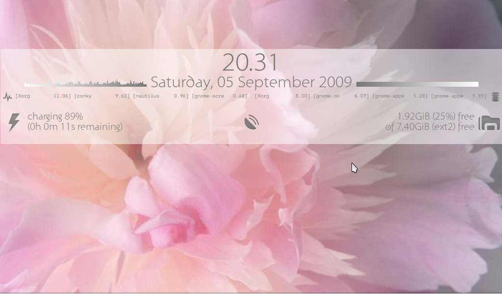
A dashboard that looks good against an ever-changing background? That’s what I wanted back in the day, so I created a pair: one light and one dark. They sat nicely over whichever desktop background I happened to be using on that day and they helped me keep an eye on all my relevant stats. 10/10
Read MoreA simple Tableau viz, small, but perfectly formed
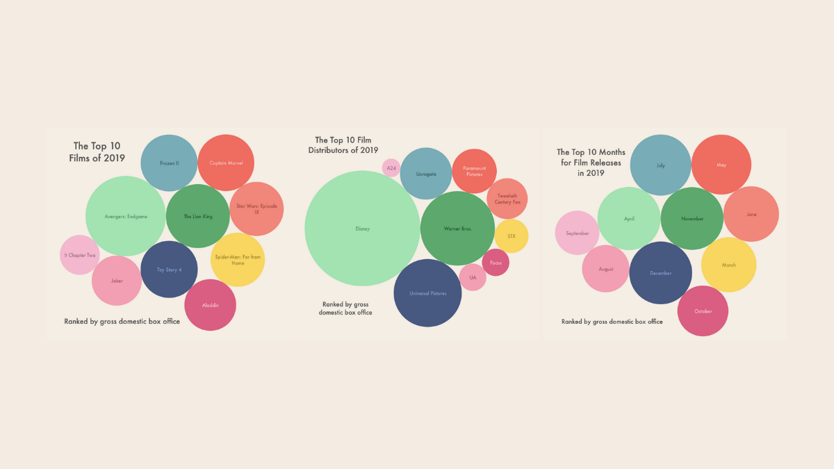
In my Tableau learning journey, I took the time to go back to basic, and aimed for something simple but impactful. These vizzes were made for Instagram, and present simple information about 2019 films in the US.
Read MoreVintage Viz: Kicking it really old school
Everyone has to start somewhere. In my case, I started visualizing basic system stats with Conky on an Acer Aspire One netbook. Good times.
Read More