Menu

Alison Pitt

×

Various thumbnails from the top of my Tableau Public page

What size dashboard should you use for a nice Tableau Public thumbnail?

Alison Pitt June 19, 2023

If you’re a pixel-perfection hunter like I am, you’ve probably noticed that thumbnails in Tableau Public are maddeningly obtuse. WHY do some dashboards look so good while others look so TERRIBLE? And why does it seem to arbitrarily cut off either the right side or the bottom of every dashboard?

I’m still holding out hope that one day we’ll get customizable thumbnails, but until that day, allow me to point out:

If you want a nice thumbnail, simply create a dashboard with an aspect ratio of roughly 1.6129:1.

Arbitrary? Yes! Scientific? Probably not! But it works. Read on to find out why…

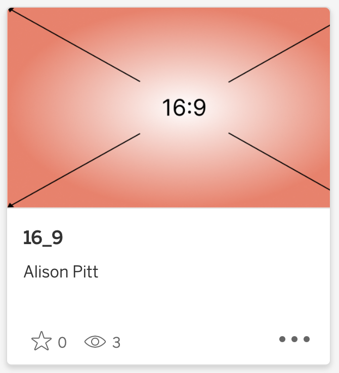
I set out this afternoon to finally figure this out after years of using Tableau Public…and Google was disappointingly unhelpful. So I decided on trial and error. I knew that it has something to do with aspect ratio since I’ve qualitatively observed over time that HD-style dashboards (16:9) tended to cut off the right side, and fatter-style dashboards (4:3 or long-form) tended to cut off the bottom. So I used Figma to create two images, one in 16:9 aspect ratio and one in 4:3. Then I made them into dashboards.

…and neither thumbnail is quite right.
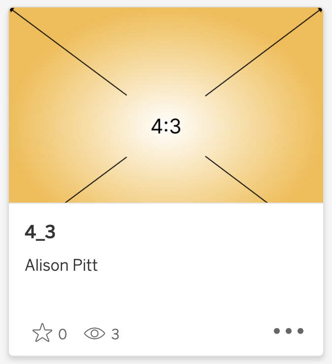
 How a 4:3 dashboard appears as a Tableau Public thumbnail  How a 16:9 dashboard appears as a Tableau Public thumbnail

The 16:9 dashboard was closer so I Googled aspect ratios near 16:9 and it turns out that 16:10 is apparently enjoying a rise in popularity, so I tried that one too. Still not quite right. It still cuts off a bit at the bottom.

How a 16:10 dashboard appears on Tableau Public

Next, I turned to my old friend: “Inspect Element”. Right-click on anything in a web browser and you can view the code that makes up that element. With images, it will usually give you more information about things like padding and styles. Sure enough, it showed that the thumbnails on Tableau Public on my Safari instance are 319 x 198, an aspect ratio of 1.612903 to 1.

Inspecting elements on the Tableau Public website reveals the dimensions of thumbnail images

I tried a couple other browsers, too: an iPad with Safari and a Windows PC with Chrome. In each, it came out to about 1.6129:1.

So I made a new dashboard with a 1.6129:1 aspect ratio and it looks great in the thumbnail.

How a 1.6129:1 dashboard appears on Tableau Public

Should you make every dashboard with a 1.6129:1 aspect ratio? Probably not. Dashboards should be the size they need to be in order to be used for the purposed they’re designed for. But at least now you have a guide to getting a nice thumbnail on Tableau Public. And if they change the design in the future, you should hopefully be able to readjust, as well. Enjoy!

You can view all of these aspect ratio dashboards on my Tableau Public:

  • 4:3

  • 16:9

  • 16:10

  • 1.6129:1

In Data Viz
← An Exploration of Incomplete Open CubesPutting my money where my mouth is →

Search

No results found
Post Archive
  • May 2024 1
  • September 2023 1
  • June 2023 1
  • May 2022 1
  • January 2022 1
  • October 2020 2
  • September 2020 2
  • August 2020 2
  • July 2020 7
  • June 2020 4
  • November 2017 5
  • October 2017 4
  • September 2017 4
  • August 2017 1

Featured Posts

Featured
How to Set up a 2-Record Seed to do Math in Tableau
Data Viz
How to Set up a 2-Record Seed to do Math in Tableau
Data Viz

When you’re exploring math concepts in Tableau, you don’t necessarily need a full data set to do it. Here’s how to use a 2-record seed to create an expanding data set for all your math exploration needs (in my case, learning about triangular numbers).

Read more →
Data Viz
An Exploration of Incomplete Open Cubes
Data Viz
An Exploration of Incomplete Open Cubes
Data Viz

For a recent JLL viz challenge and Iron Quest, I explored an Alteryx + Tableau recreation of Sol LeWitt’s “Incomplete Open Cubes” (1974). I created all the cubes, then I visualized them in Tableau; this is how I did it.

Read more →
Data Viz
What size dashboard should you use for a nice Tableau Public thumbnail?
Data Viz
What size dashboard should you use for a nice Tableau Public thumbnail?
Data Viz

It’s not obvious what dashboard aspect ratio to aim for if you want a nice-looking thumbnail on Tableau Public, but I did some digging and found the best one. For now, at least.

Read more →
Data Viz
Let's talk about recovering from setbacks
Audio Production, Data Viz
Let's talk about recovering from setbacks
Audio Production, Data Viz

I scrapped a whole video because it wasn’t up to scratch. Afterward, I made a video about not making a video. Let me explain!

Read more →
Audio Production, Data Viz
7 things you can do to up your data game while job searching
Data Viz
7 things you can do to up your data game while job searching
Data Viz

So, you’re a data nerd, you’re looking for a new job, and you just reached the end of the list of jobs to apply for. What do you do next? This is exactly the situation that I have found myself in several times in the last few months, so I thought I’d compile a list of the things that I’ve done to keep myself engaged while in a lull.

Read more →
Data Viz
Visualizing Star Trek
Data Viz
Visualizing Star Trek
Data Viz

It’s no surprise that I’m into Star Trek. So what happens when my love of data collides with my fandom? I make a viz that turns the scripts of my favorite movies into an explorable piece of art.

Read more →
Data Viz
A few pitfalls of the small data set
Data Viz
A few pitfalls of the small data set
Data Viz

Think a small data set is easier to visualize? Think again. You have to pay as much attention to what’s NOT in the set as what is…or you risk misinforming your audience! This article explores some of the recent pitfalls I tried to avoid in the latest Makeover Monday challenge.

Read more →
Data Viz
Vintage Viz: Beautiful rings on your Linux desktop with Conky
Data Viz
Vintage Viz: Beautiful rings on your Linux desktop with Conky
Data Viz

System stats can be beautiful, too. Once upon a time, I used Conky on Ubuntu to visualize things like memory usage, disk space and battery percentage, rendered as dynamic rings right there on my desktop.

Read more →
Data Viz

Affiliate disclosure - Privacy policy - Terms of use