Let me tell you a story: when I was a junior in high school, I studied AP Physics with a teacher called Dr. Dell. He was a notoriously difficult grader, and it was well-known that no one ever got above about a 50% on any of his tests. He turned out to be a wonderful teacher, though, since I aced my AP Physics exams and pretty much every physics class thereafter. But I digress.
Dr. Dell had a really challenging method of teaching, where he would teach you two completely separate concepts and then - surprise! - expect you to put them together on the exam. That kind of thinking works really well in both math and physics, and while it was frustrating at the time, it led me to a lifetime of looking for ways to combine things in interesting ways. I credit Dr. Dell with not only inspiring me in physics but also in all sorts of other things for this reason, including math, data analysis, cooking, crocheting and much more.
So what does physics have to do with a heart-shaped graph?
Well, not really anything, except it shows motivation. Let me explain…
I have been working my way through online tutorials of various interesting-looking charts when I happened upon Rajeev Pandey’s rather excellent radial bar chart tutorial for Tableau. Coincidentally around the same time I also read Jeffrey Shaffer’s post on drawing shapes (specifically a heart) in Tableau.
Now, these two blogs highlight similar but also different Tableau techniques: both make use of a scatter plot to “draw” a customizable graph, but Rajeev’s used a radial plot and Jeffrey’s leveraged parametric equations. Still, they weren’t miles apart and I thought, “surely I can combine the two to create a shaped radial bar chart”. I couldn’t find anything on Google that was quite what I was after, so I tackled it myself.
Author’s note: If you know of any tutorials or examples where other data vizzers have used parametric equations in this way, please drop me a line at info@alisonpitt.com. I’m looking for collaborators!
Before you start
In a second, I’ll walk you through the steps you need to recreate my heart graph (and maybe some other shapes of your own!). But first, some required reading:
How to create a radial bar chart in Tableau - by Rajeev Pandey on the VizArtPandey blog. This gives you the background you need to draw the “bars” (they’re lines, really) going around a shape.
Drawing shapes in Tableau - by Jeffrey Shaffer. This covers how parametric equations work, and specifically how to draw a heart.
Beyond “Show Me” - by The Flerlage Twins. This three-part series has step-by-step instructions for getting started in plotting your own graphs. It should be required reading for anyone working with Tableau!
THE HEART, step 1: Understanding what we’re looking at
For the full, interactive viz I’m referring to, scroll down to the bottom of this post, or view in on Tableau Public, here.
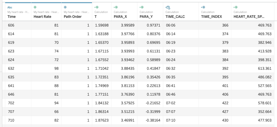
The data set for this viz is incredibly simple. It is only a timestamp, and a heart rate. I manually entered these from my Apple Watch health data.
The data table from my “Heartquake” viz
Everything else you can see here in the data source is a calculated field, which I’ll explain shortly.
As for the graph, what you’re seeing is simply a 24-hour clock, with bars representing heart rate measurements, spaced out around the clock according to timestamp. Note that until 6:06am, there are no measurements, because I was asleep. In the interactive viz, you can click on the hamburger button to show some annotations of what was happening in my day.
I also want to point out that the scale of the bars is not linear. Because of the heart shape, it’s actually pretty hard for an observer to judge the length of something happening on the far right of the graph at its widest point, from another, narrower point. So I used an exponential scale to exaggerate the visual difference between low and high values. I’ll explain later how I did this, and I’ll also call it out further when I discuss the limitations of this sort of graph.
I applied some fun colors and size variations on the plot, both based on the value of the heart rate, for no other reason than to make it look pretty.
THE HEART, step 2: Prep the data
In Rajeev Pandey’s blog, he uses a SQL query to pull in two sets of data and add in a “path order” column. He’s also got a good rundown of why you need to do this.
Sadly, the SQL feature he uses is not available in Tableau Public. Joins have been replaced with relationships and the Custom SQL Query option just isn’t there anymore. I’m not enough of an expert in Tableau Public (yet!) to know how to work around that, so I opted to do it manually, in my data source (I used Google Sheets).
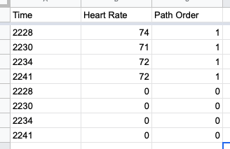
It’s simple: in your existing data set, add a new column called “Path Order” and set the value to 1 all the way down. Then copy the whole set, and zero out both your measurements and the path order value. It should look something like this:
An extract of the prepped data set for my “Heartquake” viz
What you’re doing here is making sure that for every timestamp, you’ve got two values representing two points on a path: the origin, at 0, and the terminus, at the heart rate measurement.
THE HEART, step 3: Set up the chart parameters
This viz uses three parameters:
The inner heart dimension INNER_DIM, which ranges from 0 to 1 and controls the inner dimension of the heart,
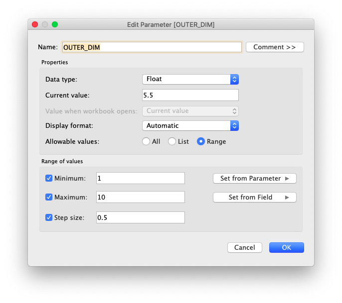
The outer heart dimension OUTER_DIM, which ranges from 1 to 10 and controls the outer dimension of the heart, and
SPREAD_FACTOR, which ranges from 1 to 2 and controls the visible spread between low and high heart rate numbers.
Settings for the INNER_DIM parameter
Settings for the OUTER_DIM parameter
Settings for the SPREAD_FACTOR parameter
Once you’ve got the parameters set up, right-click on them and show them in your worksheet so you can tweak them as you work.
THE HEART, step 4: Condition the heart rate into a usable measure
Since we’ll be constraining the heart rate measure between two parameters, we want to normalize it first. Applying an exponential factor will also make the highs and lows more visible. I did those two things in two steps.
First, create a calculated field called HEART_RATE_SPREAD that applies the SPREAD_FACTOR to the heart rate:
HEART_RATE_SPREAD = [Heart Rate] ^ [SPREAD_FACTOR]Then, create a calculated field called NORMALIZED_LENGTH that constrains the HEART_RATE_SPREAD between two dimensions around the shape:
NORMALIZED_LENGTH = [INNER_DIM] + IIF(ATTR([Path Order])=0, 0, SUM([HEART_RATE_SPREAD])/WINDOW_MAX(SUM([HEART_RATE_SPREAD])) * ([OUTER_DIM] - [INNER_DIM])) We’ll use the NORMALIZED_LENGTH when we actually plot the chart, in step 6. (With thanks to Rajeev Pandey for this calculation.)
THE HEART, step 5: Set up the parametric equations governing the shape
First, set up T, which will be the parameter that we step through to plot the heart. In my case, I wanted T to represent radians, ranging from 0 to 2 * PI(), which would take the chart through a full circle. I also wanted T to correspond to, essentially, minutes on a 24-hour clock face. To get this, theoretically, you should be able to use the following pseudo-equation for T:
T = (((hours * 60) + minutes) / 1440) * 2 * PI()I had some trouble with my Tableau timestamps, so I parsed a string instead, which was in the format HHmm (24-hour hours + minutes). That was a two-step process:
TIME_INDEX = (INT(LEFT([Time], LEN([Time]) - 2)) * 60) + INT(RIGHT([Time], 2))T = (sum([TIME_INDEX]) / 1440) * 2 * PI()Once we have T, then we can use that parameter with Jeffrey Shaffer’s heart-shaped parametric equations:
PARA_X = 4 * SIN([T])^3PARA_Y = (3 * COS([T])) - (1.3 * COS(2 * [T])) - (0.6 * COS(3 * [T])) - (0.2 * COS(4 * [T]))I purposely chose, for this viz, to decouple the parametric equations from the plot, so that in the future, one could change the parametric equations and change the plot’s shape, without having to rewrite any of the rest of the workbook.
THE HEART, step 6: Plot the heart!
To plot the heart, we’ll need a couple more calculated fields:
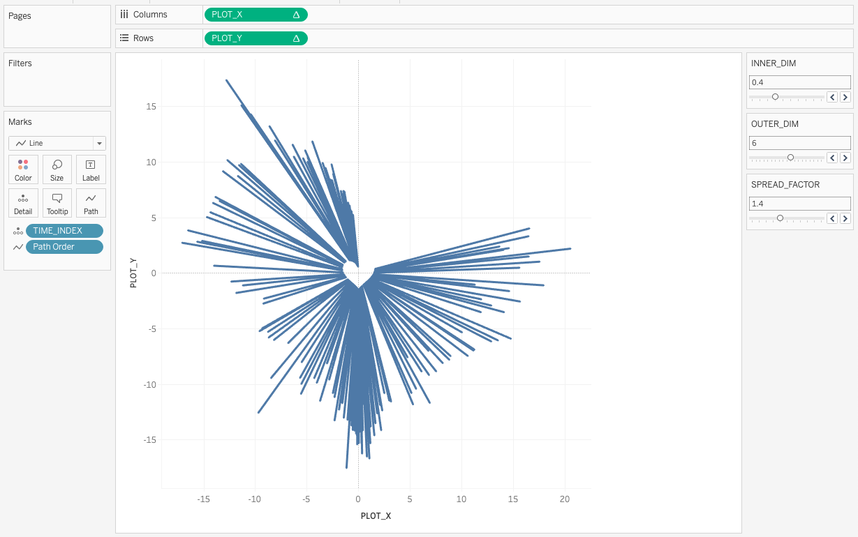
PLOT_X = [NORMALIZED_LENGTH] * [PARA_X]PLOT_Y = [NORMALIZED_LENGTH] * [PARA_Y]Once those are in place, drag PLOT_X to the columns shelf and PLOT_Y to the rows shelf.
Then to draw the graph, choose Line for Marks, drag the TIME_INDEX pill to Marks Detail, and the Path Order pill to Marks Path. Then in the Rows and Columns shelves, set PLOT_X and PLOT_Y to compute using TIME_INDEX. Et voila!
The very basic heart graph, before customizing
Next, you’ll want to play with the graph’s appearance!
Tweak the inner and outer dimensions, and the spread, until it looks like you want
Add color and size variations to the lines to make it more dynamically visual
Play with the scale of the axes to adjust the aspect ratio of the heart (or fix them square so it doesn’t change)
Remove or change the background gridlines and axis labels
Format the tooltips to customize what you see when you explore the heart
From here, it’s up to you what the final version will look like.
Author’s note: if you play with this technique and use different parametric shapes, drop me a line at info@alisonpitt.com. I want to see how other people do it!
Other notes about the viz
As with most of my vizzes, I used Canva to create an image, which I used as a background for a dashboard.
I was inspired by Lindsay Betzendahl’s post about show/hide containers for annotations. I wanted this viz to be impactful, so I didn’t want annotations to clutter up the impact of the heart. But for those wanting more context around what was going on in my day, I wanted an easy, visually logical way to annotate the graph, and her suggestion was exactly what I needed.
I was heavily inspired by Agata Ketterick’s excellent Mom! viz, although I didn’t realize it until afterward. I’d clearly seen it in my timeline somewhere and it hit a nerve. Certainly, my desire to show a simple data set in such a visually compelling way was definitely kicked off by Mom!
Self-critique. Or, limitations of this particular method
While this heart-shaped graph is certainly interesting to look at, and interesting from a theoretical perspective, and I like to think it’s impactful. It has some significant limitations, and realistically, in all but largely artistic presentations, I can’t really recommend presenting data this way.
The biggest issue here, and what I would consider the dealbreaker, is that visually, you really can’t tell the difference between high and low values at a glance. I mitigated that somewhat by introducing the “spread factor”. But even the spread factor doesn’t make up for the fact that it’s hard, visually, to understand that these points are starting from different distances from center.
As I was reading the graph back to myself (and explaining it to my partner a couple times), I realized that my brain was looking at the outer limit of the graph as a circle, rather than as a heart shape, which is what it is in this case. (You can test that theory by making it so that all the heart rates are the same.) In an ideal world, I would further transform this graph into one where the inner limit is a heart but the outer limit is a circle, which might help. But fundamentally, the issue here is that it’s really hard for us to compare a line pointing one way on one side of a graph, with another line pointing another way on another side of a graph. So if you use this in a viz, you will probably need to do a lot of explaining to tease out what’s really important.
One other (more minor) issue I have with this method is that the inner and outer dimensions are more like guidelines than limits; my chart with an inner dimension of 0.4 and outer dimension of 5.5, with a spread factor of 1.4, runs from about 0.6 to 20 on the graph. Not intuitive. I’m fairly certain that one could fix that with math (what can’t you fix with math?!) but that was a level of detail further than I was willing to go here.


