The images in this blog post were originally published on my old blog, My Little Desktop. Which is still up, if you care to read through (although much of the information is now outdated).
Back in the day when I was big into desktop customization (I’m mostly a “vanilla” gal now - more on that another day), it was very important to me to create a system monitor dashboard that looked good across a variety of desktop backgrounds. I was known to meticulously curate a folder with “candidate” backgrounds and cycle through them on an almost daily basis. There’s probably an old system backup of mine somewhere will all of those old backgrounds, now hopelessly low-res for today’s machines.
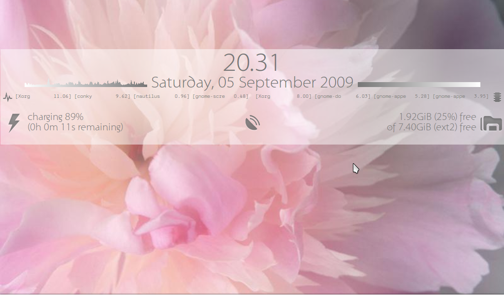
To accommodate all those backgrounds, I designed a system monitor dashboard with a semi-transparent, solid color background, so it would more easily sit atop any picture I chose. And of course, because of the frequency with which I changed my desktop, I made two versions: a dark and a light theme. This dashboard was created with Conky (a lightweight system monitor for X). At the time these were created, I was running Ubuntu on a run-of-the-mill Samsung laptop (R519, if I remember correctly).
Sadly, the color gradients on this dashboard don’t really mean anything, and if I’m being critical, probably are misleading. They’re literally just to show a nice visual dynamic, rather than add an analytical dimension to the the graphs.
Anyway, you can see what this dashboard looked like against a variety of backgrounds, in both light and dark versions, below. Enjoy!


