In this week’s Makeover Monday challenge, I looked at penguins!! Okay, I looked at data about penguins. (And thanks to beautiful artwork that Allison Horst created to accompany the data, I did look a little at actual penguins.)
I was strapped for time this week, so rather than tackling a new method of data viz, I spent my time reading about Antarctica and playing with the different parts of the data set. Mostly, when I started playing with the data in my now-ubiquitous “data” sheet (the sheet I make for playing with the data, where I can see all the raw data cut different ways), I found what had already been done. I reproduced the original charts that came with the data set. Tick!
Then I tried something different and calculated the ratio of bill length to depth, which kind of approximated the “shape” of a penguin’s bill, in that it described how long and/or thick it was. Not surprisingly, the data grouped nicely by species, and the “shape” didn’t vary much with body weight.
Now, if you’re reading this and thinking “duh”, then you’re not alone. I thought that too. Of course the shape of a penguin’s bill would stay relatively the same, regardless of the size of the penguin! That’s literally one of the ways we know what a given species looks like! You can see that phenomenon in humans too…barring some variation, we all have roughly the same size noses compared to our faces. That’s how you know humans aren’t elephants. (There might be some other factors in there too, but you get my point.)
Still, even though I think my conclusion from the data is obvious, I thought it worth visualizing, and for good measure, I threw in a simple bar chart with fixed axes, so you could see, graphically, how the shapes of the three bills compare. In this case, for this challenge, I chose to create a story around a single metric, and just make it cool to read.
Excluding the bad data
One note I will make about the data for this challenge: I did end up excluding some of what I judged to be “poor” data. In the raw data set, there was a comments field, where the researchers could note anomalies from a perfect data point. These were things like “not enough blood for isotopes” or “nest never observed with full clutch”. I’m not versed enough in this particular area of study, and there were enough data points (I felt) without using any of the anomalous ones, that I chose to exclude them all, and I only included points with “null” in the Comments column.
Notes about the viz
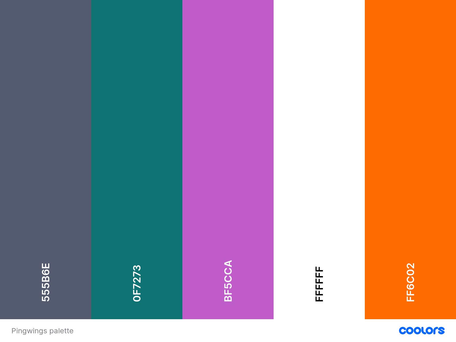
This viz is a pretty standard scatter plot with trend lines, and a bar chart with fixed axes. The background was once again created in Canva. And finally, I did create a small palette off the colors from Allison Horst’s excellent illustration, to tie it in visually.
My color palette for Makeover Monday 2020w28. With thanks to Allison Horst
Cool things about Antarctica
If all of Antarctica’s ice melted, the sea would rise 60-65m (200ft) everywhere
Around 90% of the world’s ice is found in Antarctica
Palmer Station, where this week’s data set was collected, is the only US station in Antarctica above the Antarctic circle
The internet extension for Antarctica is .aq
The coldest temperature ever recorded on Earth was -89.2C, in 1983. You probably want to take a jacket if you ever visit
More here >> Antarctica Facts


